At Walk West, we are user-first.
Whether we start design with mobile or desktop first depends wholly on the audience. After thorough discovery, we understand the current users and merge that knowledge with both the business goals of our client and the individual buyer personas to come up with an approach that will hit on the right cylinder. There’s nothing wrong with mobile-first or mobile-last thinking, but there are benefits and consequences of each. This article will center on the flaws of the mobile-first mindset.
A Brief History of Mobile-First
The history of mobile-first really began with Steve Jobs’ keynote debuting the original iPhone. I remember watching, almost in awe, as Steve would “pinch-to-zoom” on a website. As I held my Blackberry, I immediately felt that the technology that I was using was a dinosaur – one that saw the meteor right over its head. It’s not often you can feel the extinction of current technology, but that was one of those moments.
Certainly, while Apple’s iPhone team worked to deliver a positive user experience for their mobile device, they looked to marry their mobile-first experience with our no-concept-of-mobile-whatsoever world. And the experience Apple developed is the primary reason why the mobile marketplace exploded. For the first time, using a phone was like, or even better than, using a desktop or a laptop. Instead of delivering slimmed down, almost unusable “mobile websites,” Apple promised to deliver the website you were looking for in its full grandeur. If you are a sports fan who at one point owned a Blackberry, you remember the awful experience of looking up a score on ESPN’s “mobile” website. It was a mess. I tried looking for a 2006ish snapshot of ESPN.com from a Blackberry device to include here, but perhaps it falls into the category of things that should never be seen again.
Apple identified a big problem that we all saw: websites were a mess on mobile. Navigational methods that consisted of pushing a telephone button that corresponded with a website navigation item was the most efficient way of laboring through a hodgepodge of unstyled text. That experience actually threatened the success of the iPhone. If their device offered only a marginally better way to navigate bad mobile experiences, it wouldn’t have the effect that Jobs and his team thought it should. So Apple did what Apple does. It thought differently and rewrote the rules. Apple didn’t have to deliver awful websites that were “optimized” for terrible mobile devices. Nor did Apple require all web developers overnight to create new, iPhone ready experiences. Apple would deliver the same experience to the user regardless of platform. And that’s where the rest of the creative world took over. But it took some time.
Even as the iPhone took the world by storm, developers and platforms weren’t ready. Major companies and even cutting edge creative agencies were still creating dual experiences, one for the desktop and one for mobile devices. This was a maintenance nightmare as you can imagine. You would often have two separate code bases, two content bases, and two pretty much of everything else.
CSS3 media queries became supported across major browsers by early 2009. These media queries allowed a developer to segment style declarations according to browser widths. For the first time, a web developer could legitimately segment their viewers and deliver the view that was right for the user at the time the user requested it. This simplified technology stacks allowing developers to have a single code base, a single content base, and multiple style bases depending upon the platform. Ethan Marcotte coined the term Responsive Web Design in his 2010 A List Apart article.
Even as responsive web design became a real thing in 2010, it wasn’t for a few more years until responsive became a staple. Because agencies and web developers everywhere have the need to support current browsers and a few legacy browsers, responsive wasn’t a safe technique until 2011 and 2012.
But before that… there was an app for that.
Apple’s iPhone 3G, the first one I personally owned, opened up its platform to third-party developers. Responsive Web Design would become a “thing” for real about two years later. The App Store was flooded with apps from just about everywhere. Developers thought that delivering an experience through an app would bridge the divide until CSS3 media queries were more widely supported. The app store exploded with useless apps basically mirroring websites. This wasn’t efficient and app development was (and still is) quite expensive.
As older browsers became unsupported, the web design community latched onto the opportunity to really create dual experiences efficiently. That didn’t declutter the app store any, but it did save a load of money from businesses everywhere.
The Problems With Mobile-First
From an agency perspective, the biggest problem with mobile-first is delivering a design to our clients with only a snapshot of the full creative. It is true that a well-built responsive website does not sacrifice the creative’s integrity and in fact, enhances it with a more fluid user experience. However, as screen real estate gets larger, there is more opportunity for creativity. As a case study in this, we’ll take the next logical screen growth iteration.
The viewports we design desktop views are usually around 1440px and at times, 1920px. These may seem like arbitrary numbers, but they’re perfectly logical given the resolution of modern screens. When showing a design at 1440px and a client demos the product on an HD television, all of a sudden things either seem small or seem shoved neatly in the center of the screen with plenty of “whitespace” to the left and right. There are reasons for that whitespace. Even on an HD television, you don’t want a reader turning his or her head to read a sentence that stretches margin to margin. Increasing font size doesn’t remedy that problem either, it just becomes a bigger problem.
The same outcome would likely occur by demoing a mobile-first design and then a full desktop view. The perception may be clouded by the smaller viewport since there are limitations to what can be delivered on mobile while still creating a quality user experience.
Graceful Degradation v. Progressive Enhancement
Graceful degradation describes a desktop-first approach. The concept here is that you start with a wide viewport and degrade gracefully as the screen gets smaller. This is still the preferred approach if you were to ask your typical web designer.
Progressive enhancement is the inverse. In other words, you start with small viewports and progress as the viewport gets larger. This is the genesis behind the term mobile-first.
Both concepts essentially achieve the same thing. The approach that is the easiest to understand for most is graceful degradation – not just for designers, but for the brands as well. It starts with the widest net and allows for larger brainstorming. As your net gets narrower, you become more disciplined in the approach. With progressive enhancement, it requires that discipline up front – and that can sometimes be a tall order.
Dueling User Experience – Desktop v. Mobile
Desktop and mobile should never be at war with each other. Fully understanding the audience through deep discovery lays out the optimal path.
Regardless of platform, the user should be able to successfully navigate and trigger a business-defined goal be it an MQL (marketing qualified lead) or a sale. If employing graceful degradation, those paths shouldn’t become more cumbersome or invisible. If going mobile-first, then progressive enhancement shouldn’t complicate that path. The user is always first.
Unintended Consequences of Mobile-First
A mobile-first strategy may yield unintended consequences if not properly planned. That’s not to say that a desktop-first approach removes the hurdle of additional consequences. But in the spirit of this article, we’ll look at a few things to take a deeper look at when undergoing a mobile-first approach.
Data Reading
Data-intense applications, either output to the screen or input through a control panel, becomes painful from a user experience perspective on a mobile device. As a case study, baseball is full of incredibly meaningful statistics that allow you to normalize careers and create fantastic comparisons between players. Because baseball has so many elements of individual v. individual, these statistics prove more valuable in comparisons than any other sport. A pitcher’s WHIP (walks and hits per inning pitched) is a core stat that will allow you to assess the individual performance of that pitcher. It’s a bit murkier when comparing quarterback to quarterback. One may have better receivers and a more robust offensive line. Baseball Reference (baseball-statistics.com) is a wonderful resource for getting in-depth with individual player statistics.
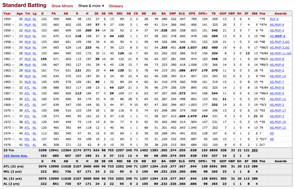
The image above showcases Hank Aaron’s career batting statistics. It’s an eyesore for anyone other than a data nerd who also loves baseball. Obviously, there’s a lot going on here. Thirty columns covering statistic definitions and 23 rows representing the years he was an active player. The columns are sortable and various hyperlinks allow you to dive into more information.

The mobile version is truncated with slight shadowing to the far side indicating more content exists off screen. The application allows nearly all of the functions the more robust desktop view does. This is well-thought-out functionally, although admittedly, Baseball Reference is 1,000 times easier to use on a desktop device. And if that’s the case, then why isn’t the desktop view the persistent view across devices? That’s not to say they didn’t have a well-thought-out strategy. Even still, it may have been easier to offer a pinch-to-zoom effect allowing users to easily navigate through UX mechanisms that are already native to most mobile device users. I’ve been to many websites that offer data-intensive views on a mobile device only to find that the information is cropped with no capability of either zooming or panning across the infrastructure. How many times have you seen an embedded infographic where the content becomes too small to see and you can’t pinch-to-zoom to get a better view?
Data Writing
On the flip side, authoring content and writing information is more cumbersome on a mobile device, naturally, than with a keyboard and a mouse. I couldn’t imagine writing this on an iPhone or an iPad. Google Docs has done a fantastic job adding mobile responsive views and native apps to its product repertoire for these purposes. But if you’ve ever tried to edit content on a complicated Google Sheet on your phone, you feel the pain. For smaller companies without billions in revenue, the tradeoff can mean a lot of money in research and development. Are time and resources better spent creating a best-in-class desktop view or split resources into teams for desktop applications and mobile applications? These questions are better viewed through the lens of Discovery, but for most, lending the most resources to the 90% of your audience who will use a data input heavy application on a desktop is probably the best choice.
Understanding Your Approach
Responsive website design and development is a given. You have to do it. Google uses mobile friendliness as a factor in how well your website performs in a search. It’s not only good practice but often delivers a better experience for your audience. How you start, either graceful degradation or progressive enhancement, carries its own set of benefit and consequence. Unless the specific audience that you’re working to please is mobile heavy, it’s often easier to go desktop first. It likely yields a better product and a more thoughtful approach if you don’t create mobile responsiveness as an afterthought. Mobility is never an enemy of the desktop. In your process of deciding to go with a mobile-first strategy, consider the following two questions:
- Does the makeup of the current audience and the makeup of the anticipated future audience dictate clearly that the mobile device is the dominant platform?
- When assessing creative, do you, your team, or your client understand mobile-first methodology or does the educational gap create too many hurdles to make it worthwhile?
By answering these simple questions, you can safely navigate the methodology of choice on a given project. With proper planning, either methodology can create a successful outcome. Find the one that creates the least amount of friction and go for it. Even if it’s not the trend du jour.


