From the moment a visitor lands on your website, they’re taking in all of its different elements subconsciously. A snappy headline can grab attention, while an expertly arranged paragraph might keep a viewer engaged enough to read it through. One element that makes a bigger impact than you might think? A meticulously selected typeface, aka typography. It will set the tone for what your visitor is about to experience.
Why Is Typography Important in Web Design?
Typography refers to how we communicate visually through text, in printed or digital material. It’s the art of arranging text to create visually appealing and easy-to-read experiences. That includes things like selecting typefaces and fonts, establishing visual hierarchies, styling these elements, and arranging them on a surface.
Designers take years to master these techniques, but just a little extra knowledge about typography can yield significant benefits when it comes to web design. Not only does typography improve the readability of a website, but it also enhances the overall user experience, which in turn leads to a more successful and engaging site. Good typography also better communicates your brand and your message to your audience. It sets a tone that visitors will remember.
The world of typography in web design is enormous and can be overwhelming at first. Here are a few essential elements that can help you get started.
The Five Key Elements of Typography
Typeface vs. Fonts

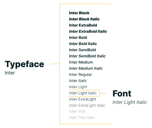
A typeface is a set of distinct glyphs that characterize a particular style of letters. There are five basic classifications of typefaces: serif, sans serif, script, monospaced, and display. Each has its nuances and subtypes, which create their unique personality and experience. Fonts, on the other hand, are the variations within a typeface, like italic or bold. In web design, you want to:
- Limit to no more than two different typefaces.
- Ensure the different fonts complement each other when paired.
- Use standard fonts (bold, regular, italic) for content.
Contrast
The difference between the thick and thin parts of a letterform makes up its contrast. This can also be the weight of a typeface, such as bold, regular, or thin. Contrast can be controlled and fine-tuned to highlight information, draw attention, create a visual hierarchy. It also makes things easier to navigate and more accessible.
Hierarchy

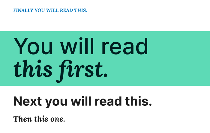
In order to keep everything organized and easy to read you need some sort of hierarchy or order of importance. Elements should be logical and make sense. Hierarchy helps achieve that. When designing for the web, create different levels of headings to establish your hierarchy through design elements such as color, contrast, and size.
Spacing
Leading, kerning, and tracking are all different forms of typographic spacing. Leading is the space between lines of text, kerning is the space between individual letters, and tracking refers to the entire spacing of a line of text. By adjusting these parameters, you can increase readability and provide a better overall user experience.
Alignment

There are 4 basic alignments within type design: left aligned/ragged right, right aligned/ragged left, centered, and justified. A rag is the uneven end of a block of text. Justification is both left- and right-aligned, which causes uneven spacing between words. Here are a few guidelines for using each:
- Long-form text is more readable when left aligned.
- Use centered-aligned text for short headlines and small blocks of copy.
- Use justified text sparingly and ensure proper spacing when you do.
Web Design Should Be Holistic
When designing for the web, there are many factors that you need to consider. While typography is a key consideration in the design of your website, it’s important to understand that it can impact other parts of your website in a big way. Typography can affect how others see your brand, how users navigate your site, how search engines like Google see your website and rank you for SEO, and how accessible your site is for users.
Good typography is a critical element of graphic design, making it an essential component of a successful website. If you want to improve your website, you need to level up your typography. Want to learn more about how Walk West uses typography to create interesting, accessible, and highly readable websites? Contact us today to talk all things web design.

