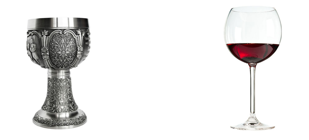
In the design world, one of the most prevalent design theories is contained in an article titled The Crystal Goblet (alternately titled Printing Should Be Invisible). In it, the author compares layout design to choosing the vessel for a fine wine. Does one choose an ornately decorated golden goblet or a simple crystal one?
The answer is the clear crystal goblet, because “everything about it is calculated to reveal rather than hide the beautiful thing which it was meant to contain.”

In design terms, this is an argument for straightforward, user friendly design over “flashy design for design’s sake.” Design that naturally and simply conveys the content it contains, so the viewer is able to focus on the thought, ideas or images, instead of the layout.
The article was written in 1955, but it is as equally relevant in the digital world of today as it was in the heyday of print design.
This post is not an argument against visual delight in web design (in fact, I recommend reading an excellent article titled In Defense of Eye Candy. I love beautiful imagery and innovative animation as much as any designer; however, it is instead an argument for asking “What should this accomplish?” before asking “How should it look?”
This idea has become even more relevant in the highly mobile landscape of the web. There are over 1.2 billion people accessing the web from their mobile devices. The reason clarity and user-minded design are so important in mobile is clear: horizontal real estate is extremely limited.
To have a successful mobile site, one is forced to choose the most relevant content, cut the frills, and figure out how to adapt a user journey to a screen just a few inches wide. This is not only possible, but has lead to a glorious revival of simplicity.
Think about the layout of your favorite apps. Odds are, the functionality of the navigation and search bar are so natural and user-friendly, toddlers can use them (and they often do, quite easily). That is brilliant interface design. The less one has to think about how to achieve an end goal, whether it’s making a purchase or finding local movie times, the more successful the app.
So when commissioning a website design, or designing one yourself, do not be seduced by eye candy before even planning your wireframes. Take Beatrice Warde’s word for it:
There is nothing simple or dull in achieving the transparent page…ostentation is twice as easy as discipline.

