On July 26th, 1991, the Americans With Disabilities Act (ADA) became the official law of the land. The law prohibits discrimination against people with disabilities for essential activities like employment and hiring, buying goods and services, and transportation in public places.
In 2010, the law was updated to include web accessibility — all online technology and electronic information must be accessible to people with disabilities. If you’d like a comprehensive resource, W3 offers an in-depth guide to what web accessibility looks like online.
Not only is designing an accessible website required by law, it’s actually the right thing to do for your visitors. By designing your website and online presence to be as accessible as possible, you’re inviting more people to the table and providing search engines with an incentive to prioritize your website.
Why Is Accessible Website Design So Important?
The short answer? People with disabilities want to browse the internet, too.
The long answer is that accessible website design is the best practice for ensuring that everyone is able to read and engage with your website. Many people with disabilities use assistive technology to help them browse the web and access content online. Plus, a website that doesn’t follow ADA guidelines is breaking the law and you could be sued.
Assistive technology is powerful; it can read and access virtually anything — as long as it’s formatted correctly.
For example, you’ve probably heard that it’s important to equip all images on your website with alternative text (“alt text”) information. If someone who is visually impaired is browsing your website, they’re likely using assistive technology like a site reader that reads out your content to them. When the technology comes across an image, it uses the provided alt text to describe the image to its user. If the image is purely design, it can be tagged as ‘decorative’ because overly detailed image descriptions can lead to a clunkier user experience for someone using a screen reader.
However, if that image is an infographic with valuable information in text, the alt text should convey that.
Without alt text, that person has no idea what the image is trying to convey and it can completely negate the rest of the information they’re trying to access. This goes for all non-text assets, like PDFs, graphics, photographs, audio content, videos, and infographics.
Search Engines Would Like to Access Your Website, Too
Search engines function very similarly to assistive technology. They essentially scan your website’s content and look for tags that describe what your content is.
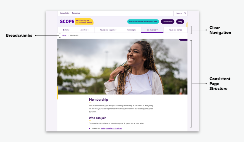
The first step to having a website that is both accessible and attractive to search engines is to have a logical site and page structure. Your website needs clear navigation, a clear sitemap, and breadcrumbs. Website navigation is essential to a user finding your site and using it to access the information they’re looking for. Search engines like Google really, really like it when a user can do both easily. Plus, a lot of the steps to making your site more accessible, like properly utilizing meta and title tags, alt text, and more, are also best practices for search engine optimization (SEO).
Tips for Designing a More Accessible Website
There are many ways to update your website to make it more ADA-friendly. Here are three quick ways to ensure your website design is accessible.
Utilize Contrasting Colors
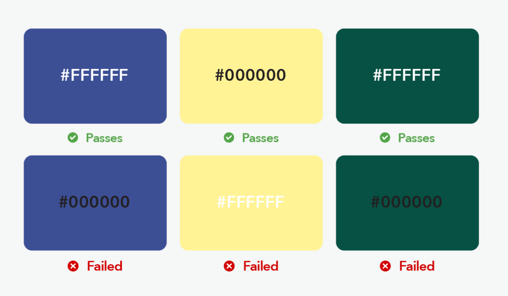
Remember early website designs in 2005? Did you ever peruse a website that had light pink text on a light blue background? Reading it probably gave you a headache. But for visually impaired people? That website is essentially a big blank spot.
The same principle applies today. To make sure visually impaired visitors can read your website, text should have sufficient color contrast with its background. If you’re unsure about your website’s text-to-background-color-contrast, use a free tool like WebAIM.
Test Your Content For Screen Readers
Screen readers are one kind of assistive technology that help people with disabilities access the content on your website. To test your website, activate screen reading by doing this:
For Mac users, press CMD + F5 to activate Apple’s Voice Over. (Pro tip: if your Macbook has a Touch Bar, press and hold the fn key in the bottom left corner to see F1 through F12 in your Touch Bar)
For Windows users, press CAPS LOCK and R to activate screen reading.
Now, once you’ve activated your operating system’s screen reading option, close your eyes and use it to navigate and read your website. This gives you an idea of what people who are visually impaired experience while on your site.
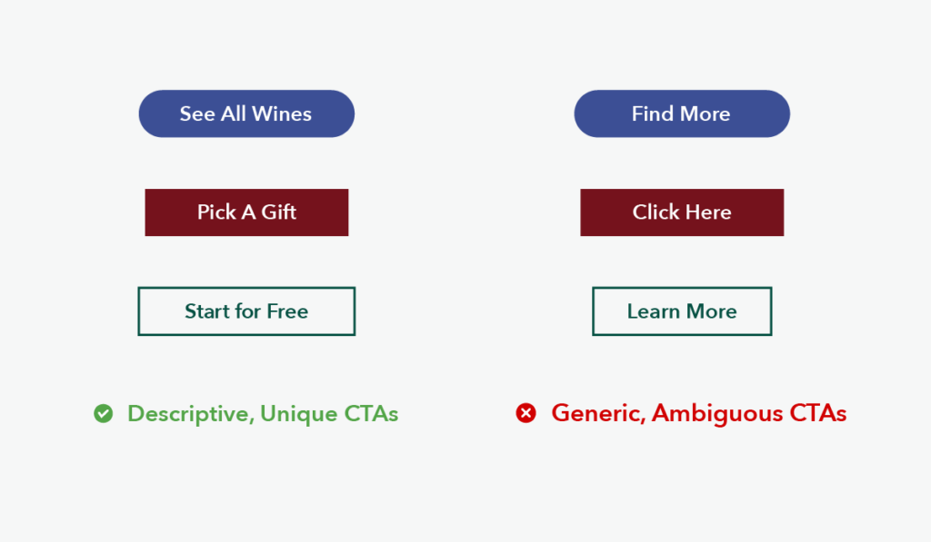
Double Check Your Calls to Action
Are screen readers able to easily navigate your hyperlinks? There are a few best practices here when it comes to hyperlinks and calls to action. By using to-the-point and meaningful text for your hyperlinks, you’re making it easier for people to navigate your documents.
Hyperlink text should be descriptive, tell people where the link is taking them, and make sense if read apart from the rest of the text on the page. In addition, phrases like “click here,” “more,” “read more,” or “click for details,” are all too ambiguous for screen readers to interpret.
In general, when writing hyperlinks, you should:
- Use meaningful text (ex: For more information on our website design practices, please visit Walk West’s website portfolio.)
- Do not use URLs within the link (ex: Visit https://walkwest.com/our-work/ for more information on our website work.)
- Do not use the word “link” within the link text.
- Do not capitalize all letters in links (or…. ever.)
- Avoid using an app like tooltips or screentips to add additional information.
Optimize Your Website For Keyboard Navigation
Are you able to navigate your website using only a keypad? For people using screen readers, the keyboard is the main way they’re able to navigate your website.
Testing it out is easy. Go to your website and hit the TAB button on your keyboard to activate all clickable elements. Then, press Enter to interact. If you’re not able to get around your website using just these two keys, then it may be time for an update.
Make Your Website Design Accessible To All
Interested in exploring more accessible design principles? At Walk West, we believe that inclusive marketing practices are essential to telling a good brand story. Creating a website that is easy to navigate and properly tagged throughout is one of the best ways to ensure everyone is able to read and engage with your brand.
It doesn’t have to be a big lift, or a big website redesign. There are little things you can do throughout your site to make it more accessible for all. Contact us today for more information.