Redesign is a process of design. A focus on updating and refreshing is important while modern design trends move forward. Redesigning for the sake of it should never be a priority. But redesigning to reacquaint your product on how people use them is important. Looking at websites built just a few years ago can sometimes be like looking at a time capsule. There is always a need to be proactive and see trends as they emerge – not simply as a way to be trendy but as a way to increase the user experience and adoption rate of the object in mind. Enter two things that many of us are well familiar with: the Passport and the Bible.
Norway Refreshes The Passport
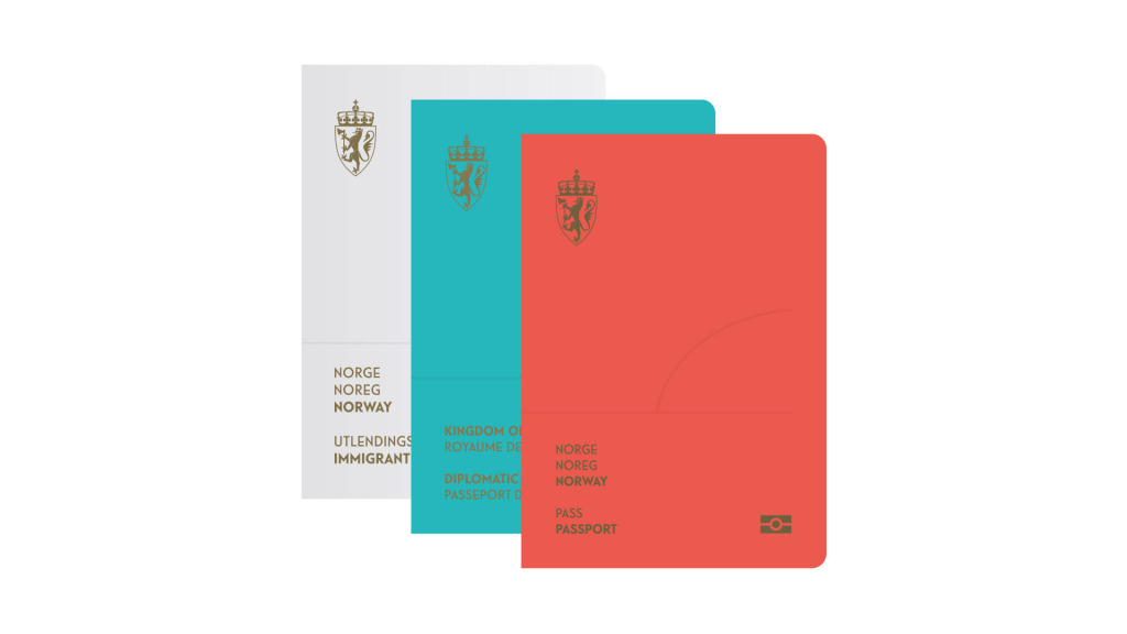
The trio of Scandinavian nations of Norway, Sweden, and Denmark are continuously on the bleeding edge of modern design. They certainly have their position well stamped in trends across the web and popular culture. Modernism and minimalism are trademarks of the unique design patterns of that region. They’ve updated and refreshed their passport with a look and feel that are intrinsically Scandinavian.

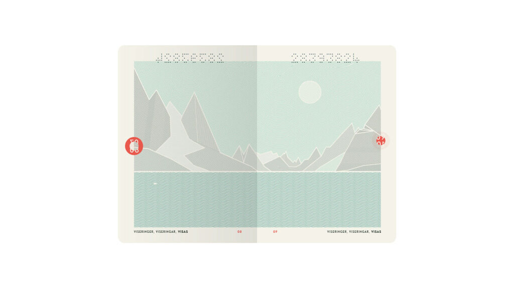
Design firm Neue Design Studio won a competition commissioned by the Norwegian government for the updated look. The passport is beautifully simple and pays homage to the minimalism that continues to define design trends that impact the digital market. Not only is it beautiful, it’s packed with a hidden feature that is completely invisible – until seen under the UV lamp that every passport goes under in the security line. When given the ultraviolet treatment, the aurora borealis pops from the page. It’s the attention to the small details that separates a good design firm from a great one.

The Bible
Some would say that a mere mention of a redesign is heresy. But I cannot imagine a more perfect scenario where tradition typically trumps trend to the fault of those using it. The Bible is a 2,000 year old text that has received minor treatments from its original writings to today’s current version that nearly all of us are familiar with. Those of us in the English-speaking world are well acquainted with the King James Bible completed in 1611. We’re working with a 400-year-old version that represents the last major revision of its kind. Along the way, copious study notes were added along the margins and footers to aid in a more complete understanding of the text along with chapters and verses to help with reference.
Enter Bibliotheca, an ambitious project by book designer Adam Lewis Greene. Greene originally posted his concept on crowdfunding site Kickstarter requesting a rather modest $37,000 to redesign the Bible. His idea is to split the Bible into four concrete books while removing chapters, verses, and study notes to help the Bible read more like a novel. This would allow him to use a nicer stock of paper on a sewn binding to make the book feel more substantial than what we, at times critically call “Bible Paper”.
The attention that Greene paid to his project is astonishing. The dimensions of each of the books will be in the same aspect ratio as the Arc of the Covenant. He’s using an original typeface that pays homage to the original works. He’s doing all of this while not rewriting the Bible and using the English Revised Version with some minor removals of flowery verbiage (replacing thee’s and thou’s with their modern counterparts).
The Kickstarter campaign was an amazing success garnering over $1.4 million for the project. It’s certainly ambitious and the end product looks amazing.

