Today’s marketing messaging is far more complex and subtle than it was thirty years ago. For instance, contemporary commercial ad writers focus more on visual storytelling and eliciting an emotional response than writing sales pitches delivered by spokespeople to directly sell viewers on the benefits of the product or service.
Case in point: some ads, such as this one by the grocery chain Food City, don’t feature a single spoken word, and yet the message comes across powerfully:
What were viewers to learn about Food City’s brand during this minute of powerful storytelling? The company wants to appeal to a multi-generational, but not too ethnically diverse demographic; also, the company celebrates family, traditions, patriotism, and military service. And, as a side note, as viewers we were supposed to infer that this family celebration wouldn’t be complete without the cornucopia of food, presumably obtained at Food City.
When a company is just getting its start, its marketing budget may not support producing such a high scale commercial ad to communicate its brand story. However, a company’s non-verbal brand communication strategy can and should be started on a much smaller scale. In fact, a brand story starts to be told with just one single graphic: a logo.
Dissecting a Logo: Three Key Visual Communicators
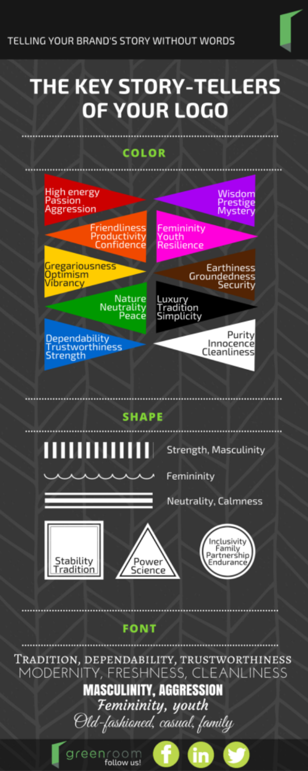
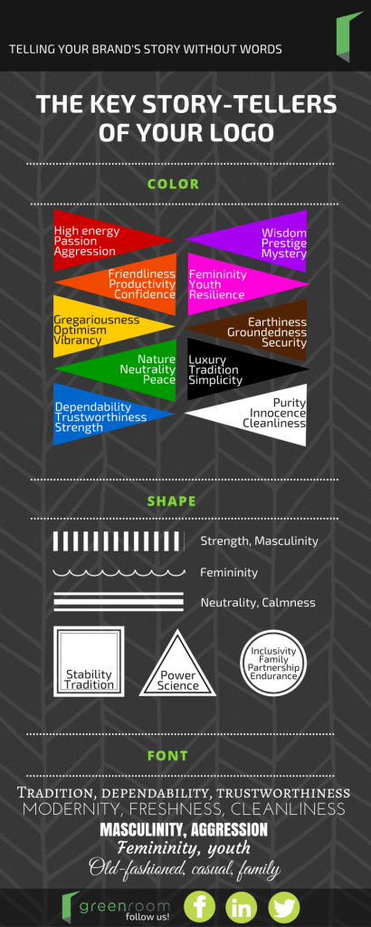
Three key elements comprise a company’s logo: color, shape, and form. Let’s explore what each option within these three key visual elements actually say about a company’s brand.
Color
Almost nothing elicits more of an emotional response and conveys a brand’s values quicker than color. Here are the values each color suggests:
Red – High energy, passion, aggression
Orange – Friendliness, productivity, confidence
Yellow – Gregariousness, optimism, vibrancy
Green – Nature, neutrality, peace
Blue – Dependability, trustworthiness, strength
Purple – Wisdom, prestige, mystery
Pink – Femininity, youth, resilience
Brown – Earthiness, groundedness, security
Black – Luxury, tradition, simplicity
White – Purity, innocence, cleanliness
Shape
Just like color, the eye interprets subtle messaging from a symbol’s shape.
Lines – Vertical lines, like pillars, indicate strength and suggest masculinity. Curved lines skew feminine. Horizontal lines, however, come across as neutral and calm.
Squares and Rectangles – The straight lines of a square suggest stability and tradition.
Triangles – Triangles have long been used in “institutions” like medicine, law, and religion; they suggest power and science.
Circles and Ellipses – Round shapes suggest inclusivity, family, partnership, endurance.
Font
Fonts play a dual role as they communicate through both the use of shape and the actual written message. Nearly 41% of companies opt for their logos to be created using a font only. Here is what those fonts communicate:
Serif – Tradition, dependability, trustworthiness
Sans Serif – Modernity, freshness, cleanliness
Angular – Masculinity, aggression
Rounded – Femininity, youth
Cursive/Handwritten – Old fashioned, casual, family
As companies grow, the values they wish to communicate may change. Also, if a company’s previous logo was created according to a fad design trend of the day, it can become outdated rather quickly. In either of these instances, a company should consider a logo refresh in order to make sure it continues to communicate accurately with potential consumers and clients.
So, what brand story does your logo tell?