
Quick access to the news and weather helped usher in the world wide web to private homes and businesses across the world. News websites are some of the oldest digital presences on the web. With the proliferation of digital based news consumption, many traditional newspapers and magazines have failed to adapt to the times and have found themselves in the red end of financial distress. Although the industry is still quite volatile, some publishers have found renewed enthusiasm for providing free and fee-based news on an inspired digital platform. Here’s how the nation’s top publishers have tackled the web.
USA Today
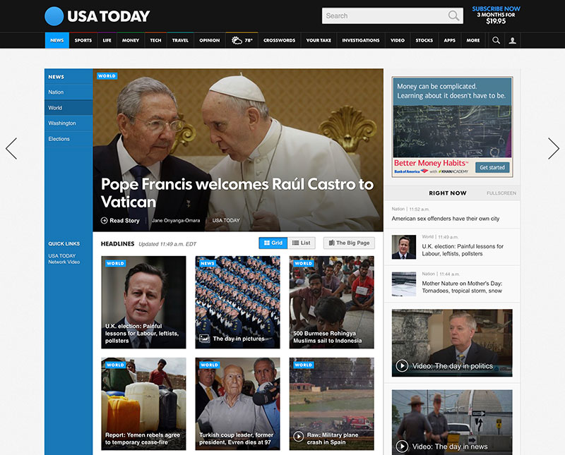
The best of the best in news digital properties is USA Today which vies with the The Wall Street Journal and The New York Times as having the largest domestic readership. In 2012, USA Today redesigned both their corporate brand and digital presences to much fanfare across the web.
The new website features a cohesive grid-based format with very few full-page refreshes as you navigate across the site. Articles pop up and in as requested and many of the interior pages infinitely scroll to reduce friction for deep navigation. Each of its subsections has it’s own unique color which helps relate types of information to the user in a very visual format.
The “Windows Metro” block format works really well here. Appropriate spacing between content pieces help to build separation and context. The overall effect is a fun experience – a word rarely used when evaluating news websites.
Grade: A+
Tribune Publishing
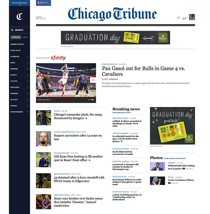
Tribune Publishing, the parent company of Los Angeles Times, Chicago Tribune, The Baltimore Sun, Orlando Sentinel, and Sun Sentinel among others. Each of these sister publications uses the same format across their digital properties.
The entire family features an elegant sliding left navigation bar – deviating from traditional patterns but in a way that is not completely unfamiliar to users. Where Tribune loses a few points is the midsection underneath the headline stories which has a tri-column layout that really pushes a lot of stories into a small amount of real estate. While more information is there to be consumed, it feels clunky and haphazzard. Overall, the entire experience is one that is enjoyable to use and navigate.
Grade: B+
The Wall Street Journal
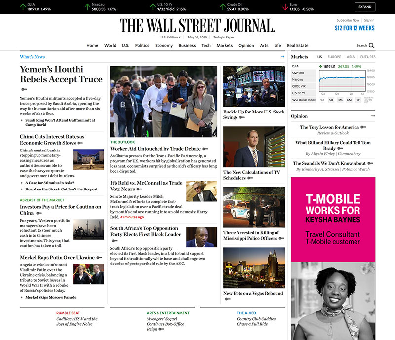
The Wall Street Journal is one of the most read publications in the United States today. It’s digital presence wouldn’t lead you to believe that was the case. Featuring a layout very reminescent of the prime of the newspaper and publishing industries, this classic look somehow feels dated in comparison to its peers. There’s very little in terms of visual hierarchy one can discern from the top stories on the page. The story on the top left is clearly the dominant factor but all the others fall into a slightly-too-small-to-be-meaningful format. The linespacing on the excerpts feels cramped – as if they’re trying to put these elements “above-the-fold” – a concept that is nonexistent in the digital world.
Grade: C
The New York Times
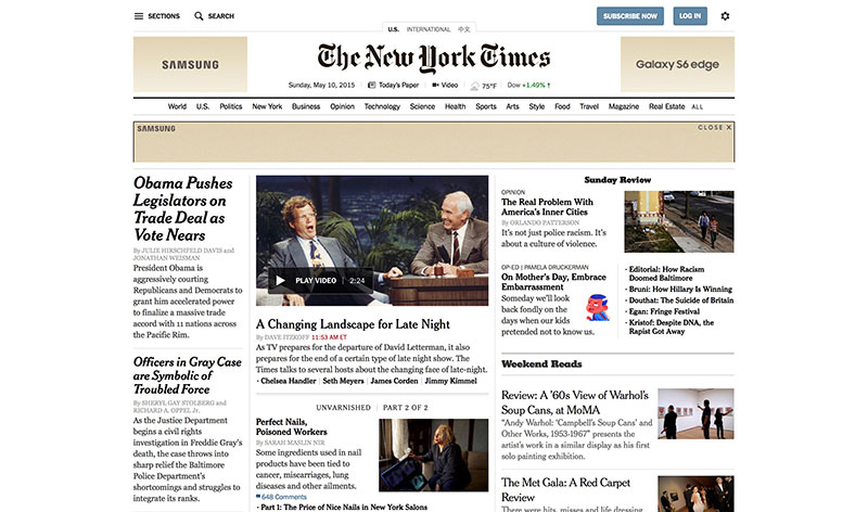
The New York Times. Ooof. Where do we start? Perhaps the most visible publication in the known world – and this is their digital presence? Not unlike The Wall Street Journal, the classic layout draws parallels to its print editions. The line spacing feels a bit more natural here than it does on WSJ, but everything on the home page feels so cramped and forced. Not to mention the ad placements feel a bit, well, beneath the esteem of the paper. Samsung Galaxy ads adorn both the left and the right of the logo – a placement that is unnatural and completely contextually insensitive. Although ads are a fact of life in the struggling newspaper industry, each paper reviewed thus far has done it elegantly without too much of the “in-your-face” mechanisms that are commonplace in low-brow tabloids and gossip blogs. There’s really not much to take away here. If we were looking to rebrand and reface a newspaper, The New York Times wouldn’t even begin to enter the conversation in regards to inspiration.
Grade: F
New York Post
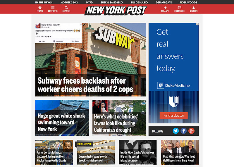
New York Post has a digital presence that feels like a tabloid… which is good because that’s what it is. The whole site feels a little bit, well, like it’s yelling. It’s the news equivalent of TALKING IN ALL CAPS. For it’s purpose though, it strangely works. Unlike it’s peers, the Post does have a cohesive presence. Its ultra-bold, high contrast fonts on top of images feels a bit cramped although it’s the same approach used by USA Today while the latter feels much more elegant and sophisticated than the former. We can’t dock points because of its tabloid nature. It achieves what it has set out to do.
Grade: B-
WRAL
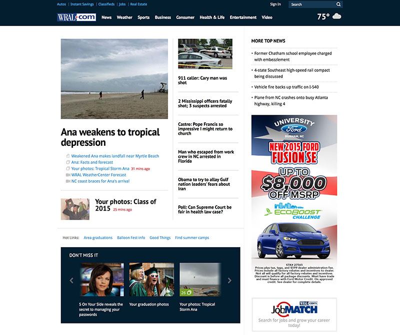
Not a national newspaper like the others in this article, we thought we’d throw a bit of attention to the local Raleigh CBS Affiliate, WRAL. Capitol Broadcasting Company, parent company of WRAL, undertook an ambitious redesign on the website last year. As to be expected, many complained about the change. Not us. WRAL was expertly executed by a fantastic team including Viget Labs out of Durham. Friend of O3, Melissa Kennedy, was a key player in the overall strategy as well.
What WRAL does right here is that the information hierarchy is easily readable giving due credence to each content type across the website. The content breathes and spacing is ample allowing the user to read in an enjoyable way. While minimalist in its approach, a complete juxtaposition with USA Today, the format works for what it set out to do: increase engagement by aiding in the overall readability of the content. It seems like a no-brainer, but I imagine those at The New York Times and The Wall Street Journal set out to accomplish the same task – but failed at doing so.
Grade: B+