It’s election season and there’s plenty of the age old he-said-she-said partisan bickering happening about. So we thought we’d get into the game and run a non-partisan review of how the candidates are doing on the digital side at this early phase of national election season.
After previewing the major candidates from each party, one thing is abundantly clear. There’s almost a uniformity around the style of each website that is quite impressive. There’s no one clear winner or loser here although some are more visually appealing than others. Contrast that with elections of yore where it was a presentation of bad and less bad.
Politics aside, President Obama set a tone and direction for how to run a digital campaign. Everything from his branding to his style quickly cascaded down from the federal level all the way to local elections. How he ran digital will one day, if it isn’t already, be a chapter in textbooks. The stamp he put on digital can be felt with each of the current Presidential contenders.
So let’s get started.
Quick disclaimer: Design is subjective. These are merely my opinion on each of the presences presented. Take it or leave it. There’s no right or wrong answer here. Except that Ted Cruz and Jim Webb have the worst presences holding down the flag for their respective parties. That’s pretty objective.
The Democrats
The democrats in general have typically been on the forward edge in modern digital campaigning. Much of this is due to Howard Dean’s impressive setup during the 2004 election… and his subsequent and perhaps even more impressive implosion due to an ill-fated “YAAAAAGGGGH”.
Lincoln Chafee

Lincoln Chafee doesn’t get bad remarks, but in comparison, the website is certainly safe. It feels almost like one of those cookie cutter WordPress templates (really, he even has a “Testimonials” section on the homepage – the language feels old and more inline for what you’d see in the B2C service space). The logo is a train wreck resembling one of those flattened pennies you get at Disney World. I’d love to know if there’s actually a meaning between the 10 stars adorning the left and right edges. Or if a designer thought: “yeah, stars, let’s pop them in there. People like stars.” Props for using green as a secondary color. Grade: C+
Hillary Clinton
Surprisingly, this is one of the worst in the field, despite Hillary being the establishment candidate from the left with plenty of cash sitting about. Perhaps it’s the establishment label that makes her staff feel it’s best to play it safe. It’s not that the website is bad, it’s more that it lacks character that others in the field have. The logo is inexplicably bad, although kudos for doing something different. The orientation of that logo is tailor made for parody on countless “I’m With Stupid” t-shirts. If I were running digital for Hillary Clinton, I would’ve reached out to Obama’s branding and digital staff around 7 years ago. Grade: D.
Hillary Clinton Official Campaign Website
Martin O’Malley

A few flaws with O’Malley’s presentation, but overall, it’s quite nice. Dual shades of blue with that gigantic red Donate Now button on the header has nice contrast. The navigation is boiled down to bear necessities, a refreshing change. The header image on the primary panel has an inexplicable blue gradient that feels like Photoshop 3.0 from a decade ago. There’s also a strange darkening of the screen as you scroll up and down. It seems to lack purpose and is doubly confusing with an accelerated scroll. The tagline feels ill conceived (are you ready for new leadership?). Regardless of outcome, I think the American population will get just that – new leadership. His logo is one of the better ones in the field with an italicized, strong font. His favicon is a headscratcher with a shortened O’M. Is that read “um”? I get it, he couldn’t go with O because that’s kind of taken. But the incomplete square outline from the logo would’ve been a great substitute. Grade: B+
Martin O’Malley Official Campaign Website
Bernie Sanders
Bernie is the populist of the group and everything about his website feels connected to his philosophical approach. The navigation is different and utilitarian, his logo is a proper-case first name (although I could do without the overused star dotting the ‘I’), and his FEC standard line at the bottom (Paid for by Bernie 2016) has a nice handwritten “not the billionaires” attached to it. It’s hard to knock the website because it does nothing wrong, but feels muted especially when you scroll down the page. Grade: B-
Bernie Sanders Official Campaign Website
Jim Webb
 Here we go. Our first real lemon. The red. I would understand this more if it were a Republican candidate. Red is kind of their thing. But you’re a Democrat and you don’t have to use red. But you did. Red can be done right and wrong. Here, Webb uses two different shades of it. One in the logo, more of a true red, and one on buttons, a burgundy. The color issue aside, the real error here is the editorial images with fascinatingly bad crops. 50% of the images on the news posts are the same, a sign that a designer did not establish creative for a post without an image. The website is standard by all accounts. And standard is not the office he’s running for. Oh but wait, the one thing that isn’t standard is a CSS stylized scroll bar. 2004 called… Grade: F.
The Republicans
There’s about a billion people running for president on the Republican side. And even though Republicans have a history of not doing digital well, I was pleasantly surprised by the digital offerings submitted by the men and women vying for the nation’s top office.
Jeb Bush
 What a surprise. I didn’t expect much when Jeb debuted his logo (Jeb!). Wait is that Jeb or is that a modified Yum! Brands logo? Given the bar was quite low, his website surprises. The color palette is one we haven’t seen in a while on the campaign trail with a burgundy, dark blue, and gold. It works. And the image he’s using to stage the website does as well. It’s likely filtered to all hell unless there’s a diner somewhere in a flyover state that looks just like the wild west in all it’s sepia-toned glory. But at a first glance, it feels authentic. Below the fold, the website turns into a media hub. It’s got a nice balance of mixed multimedia and even has the word Sharkando in there (do we give points or doc points? I’m not sure…). Grade: A.
Jeb Bush Official Campaign Website
Ben Carson
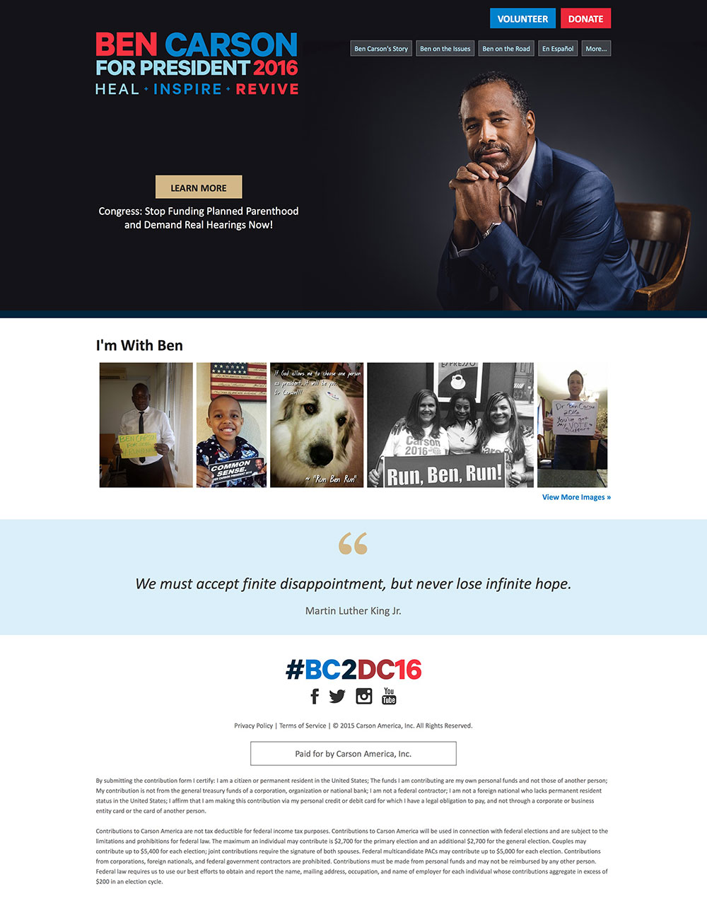 Sharp suit, Ben. That’s about as far as I can go here. Aside from the interesting photo, one that presents Mr. Carson as someone I’d genuinely like to meet, the rest of this is bad. From the top… The logo might as well be flashing with that hodgepodge of colors and text. We’ve got 3 pretty distinct colors up there, but the Learn More button on the primary panel is… beige? The navigation bar is a series of buttons that look stock from whatever $50 theme this website was purchased from. Scrolling down and we get a hollow presence saying not much of anything. Grade: F
Chris Christie
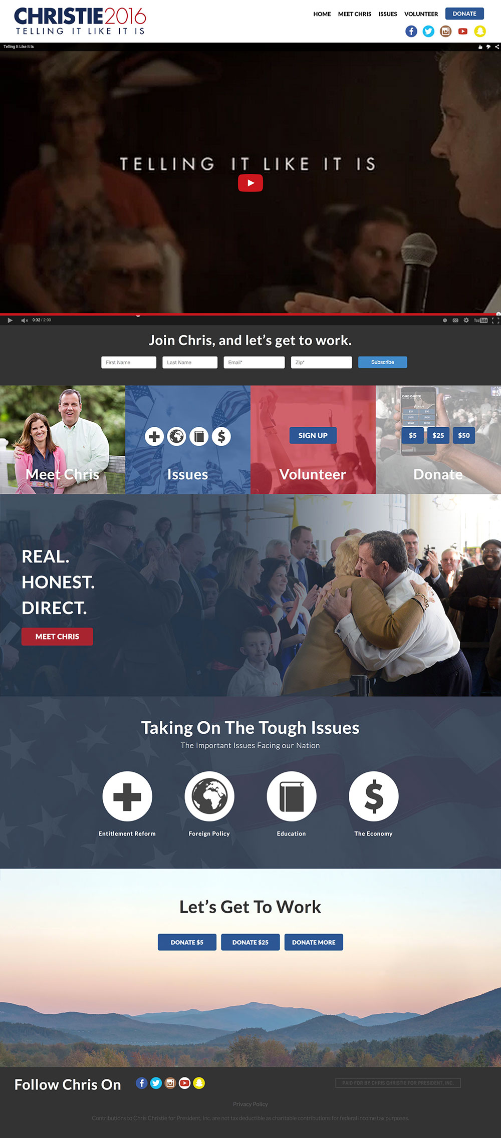
YouTube! Nothing screams “where’s my mute button” faster than auto playing video. OK, it’s different. But different is as different does I suppose. Let’s ignore the video and give it a scroll. The rest of the site has a distinct Windows Metro feel to it, but a lot of the areas have washed semi-opaque filters on them that makes it more distracting than it is helpful. There’s nothing much that is redeeming. A final question though. What is that yellow social icon? A hover says “christie.2016”. Clicking on it? It does nothing. Grade: D-
Chris Christie Official Campaign Website
Ted Cruz

What is this? A campaign website or Amazon? Below the fold in a big bold fashion is Ted Cruz’s book for sale. Scrolling down and you get some extremely choppy parallax scrolling that is distracting if nothing else. There’s so much going on and almost none of it feels organic. There’s very little to praise. Grade: F.
Ted Cruz Official Campaign Website
Carly Fiorina

Most modern political websites have those splash pages, a bit of interruptive advertising for “issue of the day”. Donate here. Stop this. help that. No thanks, I’ll “continue to website”. Carly doesn’t have one of these splash pages, but she might as well. Her homepage is two calls-to-action: Meet Carly and Join Us. I’d prefer if the page defaulted to Meet Carly as that is a pretty nice layout. There’s not a ton of content on the website and that perhaps influenced it’s multi-page layout which really didn’t need but one or two strong ones. Solid effort though. Grade: B-.
Carly Fiorina Official Campaign Website
Lindsey Graham
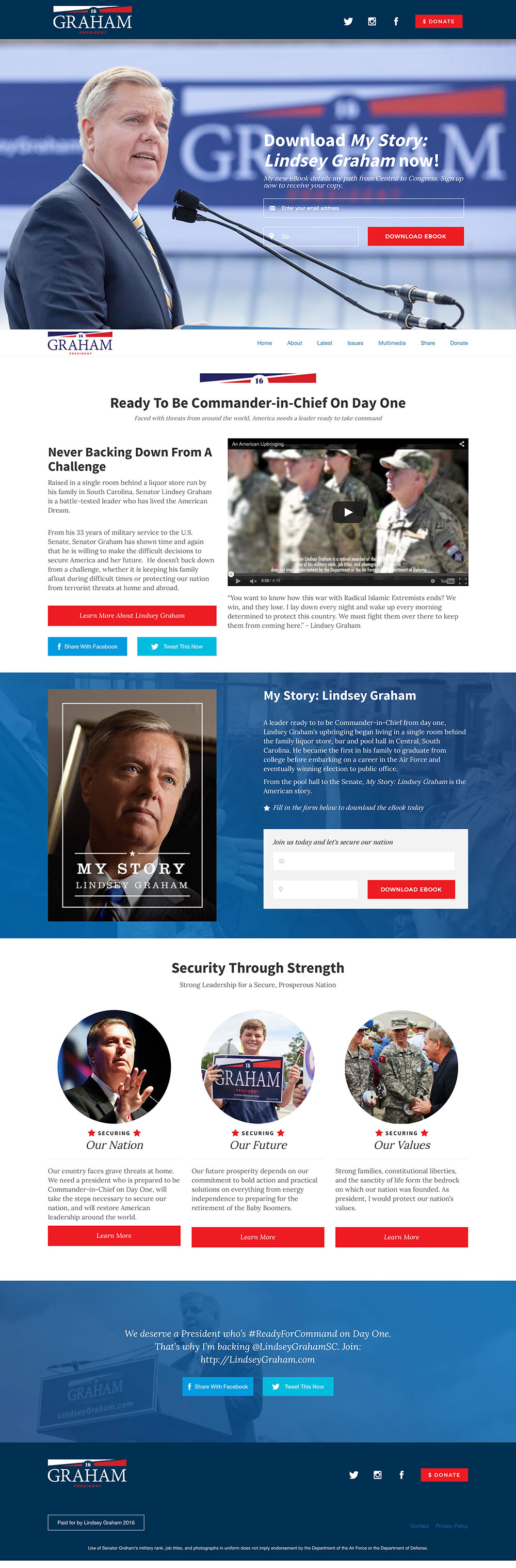
Not the strongest of efforts by the Senior Senator from the friendly Carolina just south of us. It reads more like an advertisement for My Story: Lindsey Graham e-book than it does a substantive case for why he should be president. Given I didn’t download the book, but one shouldn’t have to do that to find out what exactly Graham stands for and why one should vote for him. There’s very little to say positive about the site, but at the same time, very little to say that is negative. It just “is” and that completely misses the mark. Grade: C-.
Lindsey Graham Official Campaign Website
Mike Huckabee
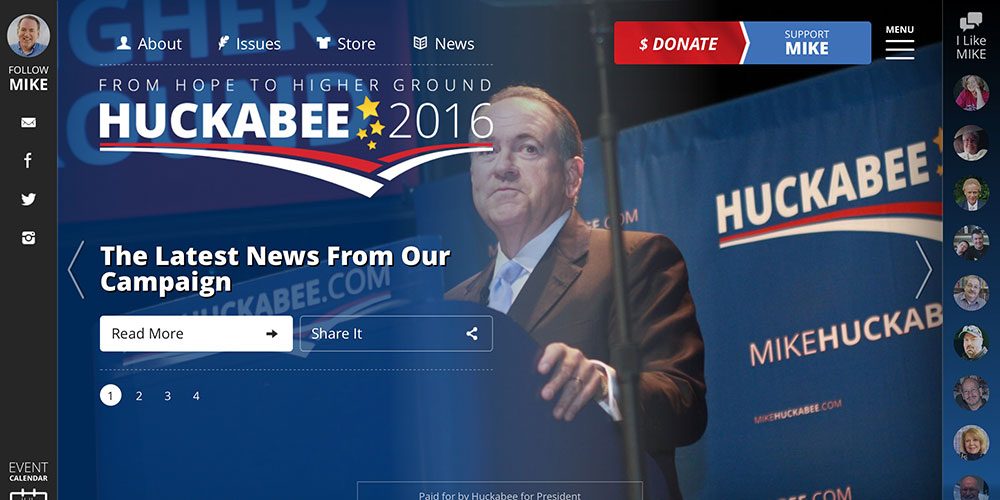
Is this real life? It’s a content hub and those can be done really well or really poorly. Jeb Bush is an example of doing it well. Mike Huckabee is an example of doing it poorly. We’ve got these two navigation bars, or where traditional navigation bars would be located, but they don’t offer up navigation. One is a contact bar and the other is a list of faces of people who have had nice things to say about Huckabee. These aren’t political influencers. These are average Joe’s and Jane’s labelled only by their first name. Perhaps their opinion means something to the average visitor, but my take is that it doesn’t. Grade: F.
Mike Huckabee Official Campaign Website
Bobby Jindal
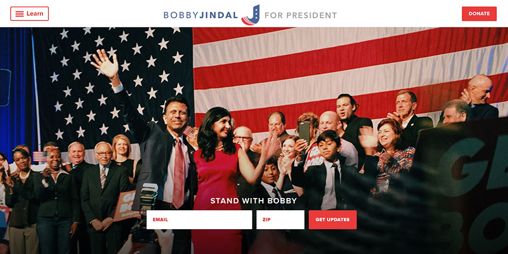
If you’re able to get past the sort of baffling J flag logo, you’d see a rather marginal web presence. It reads a lot like Lincoln Chafee’s… very standard. Again, there’s nothing seriously or gravely wrong about the website, but it does almost nothing extraordinarily well. Average. I’ve seen worse. And better. Grade: C.
John Kasich
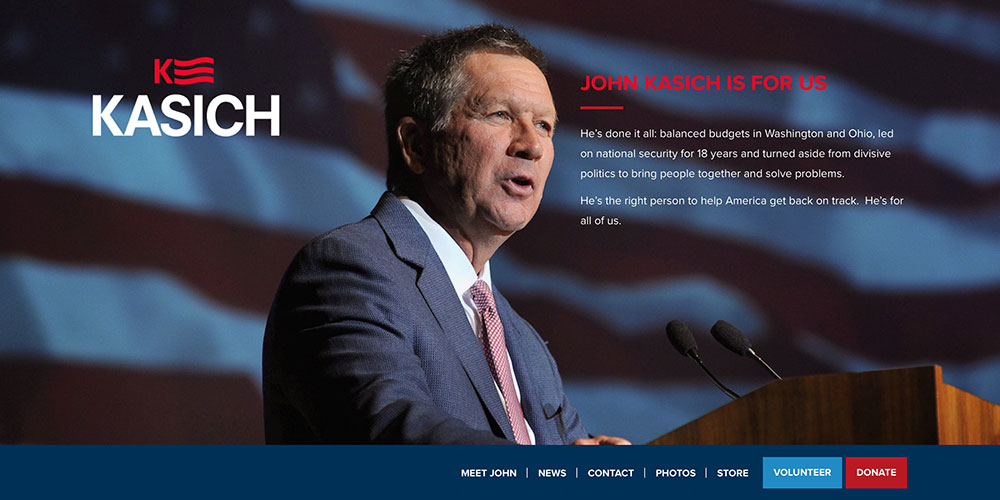
We’ve got our first sorta-kinda House of Cards logo with John Kasich. The rest of it is inline with Chafee and Jindal. Except slightly worse. The form field below the navigation could use some styling. The social media download section has no label. It just asks you to Download Full. Confusing for what they’re asking you to do. It’s muddy to say the least. Grade: D+.
John Kasich Official Campaign Website
George Pataki

I love the Apple-esque simplicity of Pataki’s site. It feels like Apple.com but instead of the latest iPad, we get George. The typeface is on point. The colors are nice. The form is well designed. And if you haven’t noticed, his logo is a ride-side-up replica of the House of Cards logo. Scrolling down doesn’t give you the same feel. But the quotes here come from actual influencers unlike Huckabee’s bewildering hodgepodge of “Tom’s” and “Amy’s”. It’s nice and above average. Grade: B.
Rand Paul
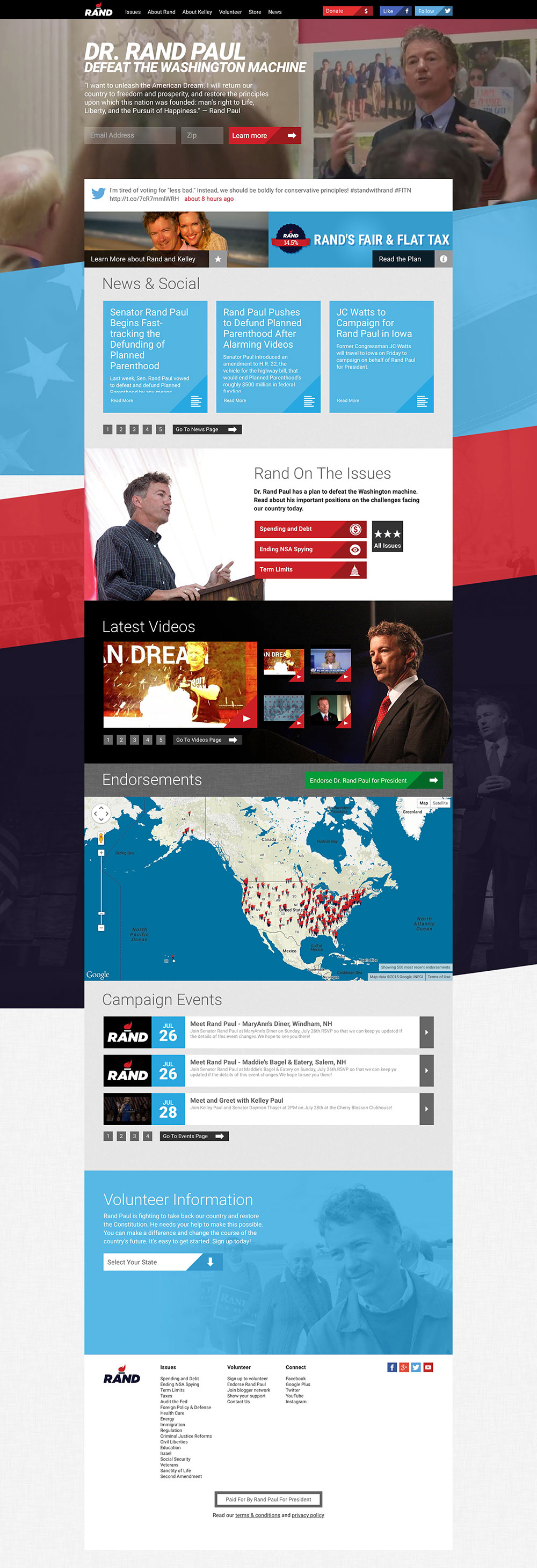
Rand Paul has one of my favorite logos. I really like intelligent use of whitespace. His logo creates the stem of a torch between the A and the N. He uses some well produced B-roll footage as a textural element on the site that does it’s job well. He uses interesting angles throughout the home page but I can’t get past the feeling of everything being squished in the center box with a lot of unused whitespace on screens of decent width. Overall, it’s not horrible. But could be better. Grade: C+.
Rand Paul Official Campaign Website
Rick Perry

Is this Rick Perry or the Philidelphia Phillies? That logo is throwback Phillies baseball. Curious that he wouldn’t pick a more natural Rangers or Astros? Logo aside, Rick Perry has the best use of B-roll footage out of all the sites I’ve reviewed. The pacing is nice, the fades are unpredictable, and it’s an interesting mix of subjects. It’s very well done. The only other outstanding portion of the site is a stat area that calls out his job creating, tax cutting, and budget balancing past, points likely to resonate with his primary audience. Because of the video, this get’s a slight bump in grade than it otherwise would have. Imagine this website with a still shot in the header… it’ll begin to look like a lot of the other average cases. Grade: B+.
Marco Rubio
 Oh, Marco. Why the US outline as the dot for the I in your logo? It’s so simple and modern without it. It’s like that extra brush stroke from an artist that ruins the entire piece. But that aside, it’s hard for me to really judge this site. Below the fold, it’s a Jeb Bush style news feed with interesting graphics. But it feels disjointed whereas Bush’s feels orderly. Grade: B.
Marco Rubio Official Campaign Website
Rick Santorum
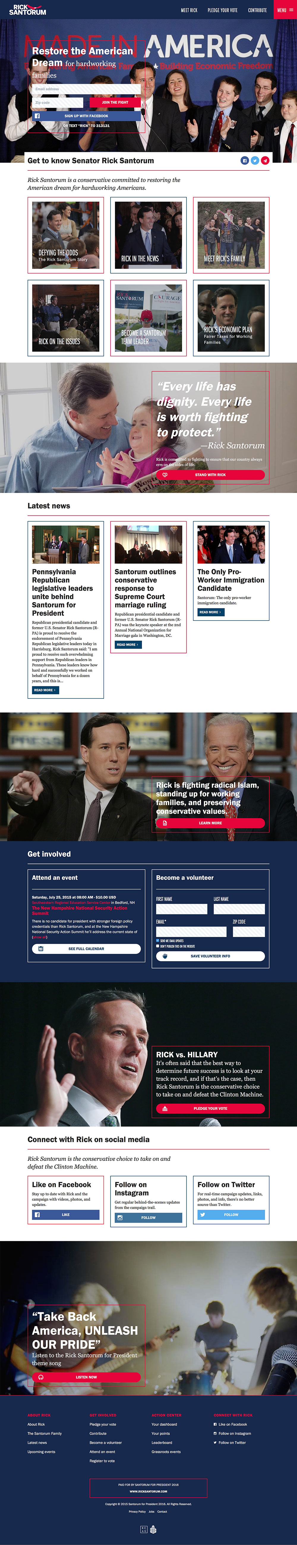
Of the average cases, Rick Santorum’s site is one of the better ones. A nice B-roll footage header and nice, photographic subsections neatly dividing the primary points pulls it all together. Interspersed are articles on campaign events and position statements. All around, this is a nice site. Site: B.
Rick Santorum Official Campaign Website
Donald Trump
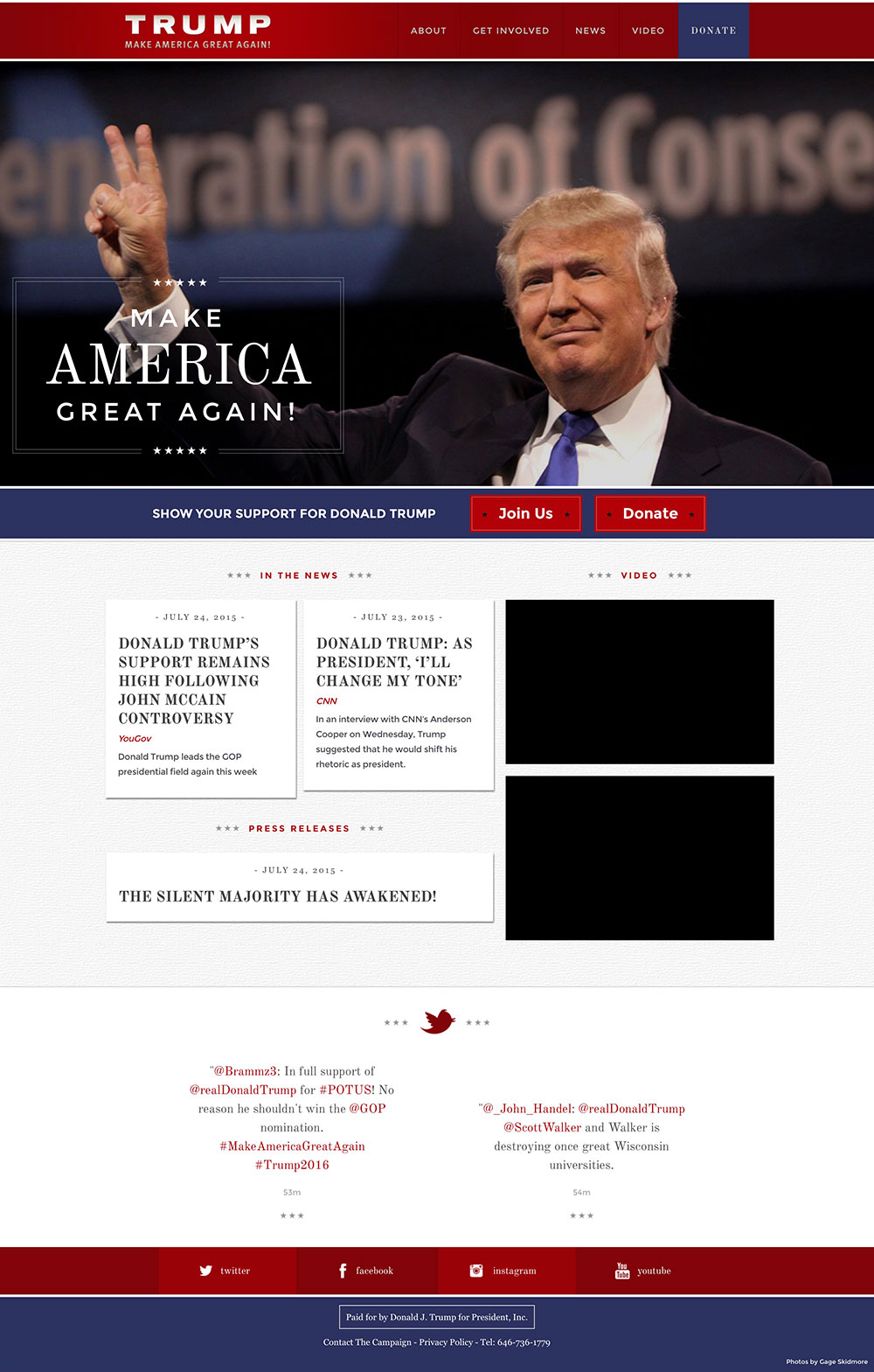
The guy with the most money is the one with the worst websites. In fact, Trump openly bragged about paying $3 for his websites. Well, he got what he paid for. The website is shallow, doesn’t tell a story, and gives very few reasons regarding why someone would vote for him. That seems like it would be the primary point you would want to drive home. Maybe with $6, we could have had something more… Grade: D-.
Donald Trump Official Campaign Website
Scott Walker
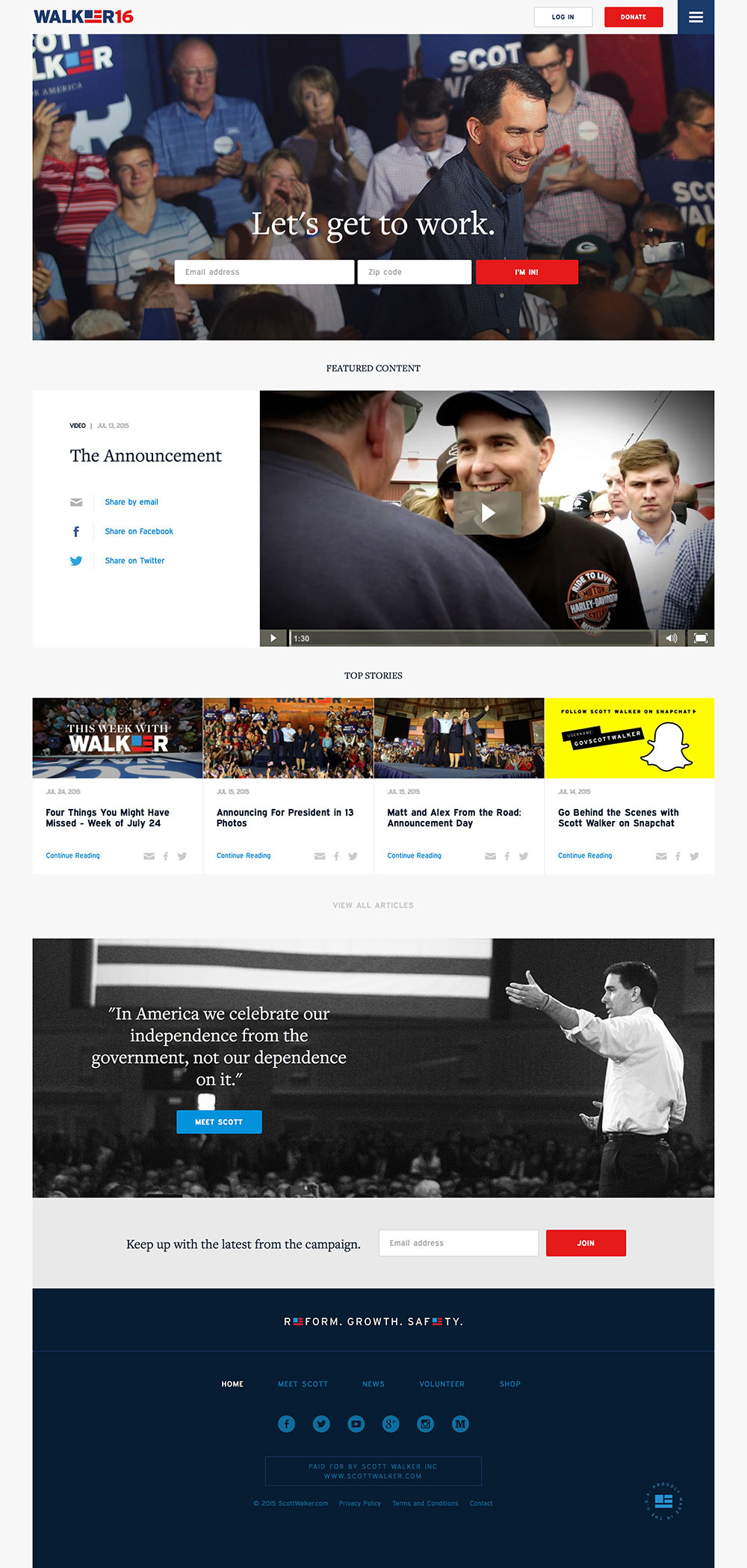 The last website in our review is Scott Walker, also the 3rd House of Cards logo redux that we’ve seen. His at least forms an E… but that’s giving points where they’re probably not explicitly due. Walker’s simplicity is Pataki-esque. It’s nice and does it’s job without doing too much. It tries without trying too hard. It’s on the positive side of average. Grade: B.
Scott Walker Official Campaign Website
The Leaderboard
Alright, so we’ve got the grades. How do they stack up? Jeb Bush gets points for doing a media hub right. Then there’s a lot of average sandwiched right above the bad. Carson, Cruz, Huckabee, and Webb… it can be a lot better.
| Jeb Bush | A |
| Martin O’Malley | B+ |
| Rick Perry | B+ |
| George Pataki | B |
| Marco Rubio | B |
| Rick Santorum | B |
| Scott Walker | B |
| Carly Fiorina | B- |
| Bernie Sanders | B- |
| Lincoln Chafee | C+ |
| Rand Paul | C+ |
| Bobby Jindal | C |
| Lindsey Graham | C- |
| John Kasich | D+ |
| Hillary Clinton | D |
| Chris Christie | D- |
| Donald Trump | D- |
| Ben Carson | F |
| Ted Cruz | F |
| Mike Huckabee | F |
| Jim Webb | F |