As a child born in the early nineties, I arrived just early enough to glimpse the tail end of the Internet’s rise to prominence. The world wide web was a revolutionary communication tool, set to grow into a novel, innovative, and critical piece of global infrastructure. It was also deeply painful to look at, on a nearly fundamental level: contrast to set your eyes on fire (dark blue on black, bright red on bright yellow, etc.), full neon-rainbow gradients, gifs flashing over every square inch of the page.
Comic Sans was still culturally acceptable, or at the very least tolerable. It was a rough transition into CSS3 and glossy smooth Javascript animations.
Yea… If you could just redesign your website, that’d be great.
And yet somehow, the wounds have healed and in their place has grown a warm, if not slightly mocking nostalgia for the style. In fact, a few websites have lapsed into very successful artifacts from a previous era.
The “Web King”

Queue “webkinglasvegas.com” – the premium $99 custom website developer. We have a warm, resonating brick background and a jaunty greeting soundtrack, as the website’s title flashes over the screen. The site hosts a number of different digital services, which you browse through and read in red, green, and blue typefaces. There are gifs of spy-men donned in trench-coats scouring the pages with magnifying glasses. An anachronism given the medieval motif? Possibly, but still, the site is golden.
The Drudge Report

Then we have the infamous “drugereport.com,” the first news source to break the story of President Clinton’s scandal with intern Monica Lewinsky. The news-aggregate site is 100% bare-bones 90’s design; it hasn’t changed its aesthetic since the impeachment. We’re still dealing with HTML tables here, and yet the traffic generated by this one page is astronomical – three quarters of a billion per month – with nothing but a three column layout of page links.
Ling’s Cars

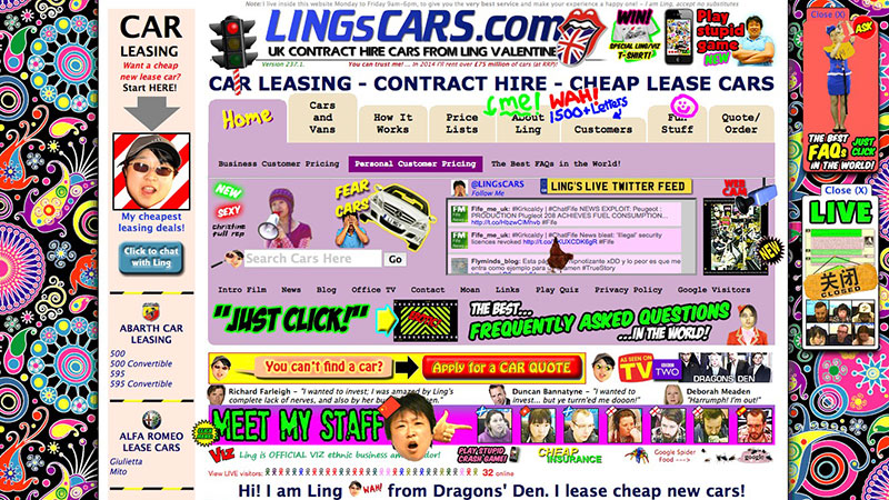
And finally, we have the coup de grace, “lingscars.com.” The introduction music is an inexplicable form of fifties dance-hall rock ‘n’ roll, set to the violent blinking of gifs that have flooded the screen. There is a striding rooster in the middle of a Twitter feed and I have no idea why. There is a severe abundance of dayglo-green “slime” fonts. There is a horrifying cat with a military helmet on; the head of the cat is having a spasm, likely induced by the insanity of the background illustrations. The site gets an average twenty-five thousand daily page views, despite have sprung forth apparently from Lewis Carroll’s imagination.
There are gems littered along the dusty corridors of old, forgotten servers from the web’s beginning that’s amazing to take a glimpse at, if for nothing else then to admire how much the Internet has grown up.

